
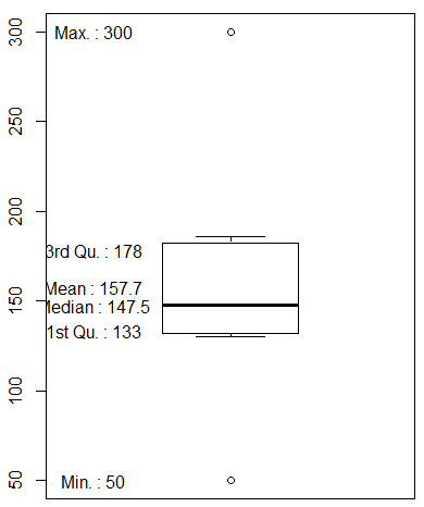
1. 상자그림 (box plot)
- 히스토그램은 자료가 모여 있는 위치나 자료의 분포에 관한 대략적인 정보를 한눈에 파악할 수 있는 장점이 있지만 구체적인 수치 정보를 쉽게 알아 볼 수 없는 단점이 있다.
- 이런 단점을 보안해서 다섯가지 요약 수치 등을 파악할 수 있는 상자그림으로 나타낼 수 있다.
- 최소값, 제 1사분위수, 중위수, 제 3사분위수, 최대값
- 흩어져있는 형태는 사분위 범위를 사용하는게 좋다.
- 범위, 사분위수범위(IQR)는 자료의 산포도를 나타낸다. 산포도는 자료가 얼만큼 흩어져 있는지 알 수 있다.
- 범위는 자료의 산포도를 간단하게 표현하지만 사분위수범위는 좀더 상세하고 유용한 정보를 제공한다.
|
data <- c(50,130,132,136,140,155,166,182,186,300) |
|
|
# 기본 사용법 boxplot(data) |
 |
|
# 사분위값 quantile() |
 |
|
# 사분위값 각 변수에 저장 min <- as.numeric(quantile(w)[1]) q1 <- as.numeric(quantile(w)[2]) q2 <- as.numeric(quantile(w)[3]) q3 <- as.numeric(quantile(w)[4]) max <- as.numeric(quantile(w)[5]) |
 |
|
# 사분위 범위(Inter-quartile range) iqr <- quantile(w)[4] - quantile(w)[2] iqr <- q3 - q1 |
 |
|
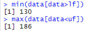
# 최저한계치(lower fence) 찾는 방법 lf = q1 - 1.5 * iqr |
 |
|
# 최고한계치(upper fence) 찾는 방법 uf = q3 + 1.5 * iqr |
 |
|
# 이상치
# 최고한계치보다 큰값은 이상치이다. |
 |
|
min(data[data>lf]) max(data[data<uf]) |
 |
|
# box plot에 값 나타내기 boxplot(data) text(1.1,min,min,col='blue') text(1.3,q1,q1,col='blue') text(1.3,q2,q2,col='blue') text(1.3,q3,q3,col='blue') text(0.7,min(data[data>lf]), min(data[data>lf]),col='blue') text(0.7,max(data[data<uf]), max(data[data<uf]),col='blue') text(1.1,max,max,col='blue') |
 |
|
# summary 사용 boxplot(data) text(0.6,summary(data), |
 |
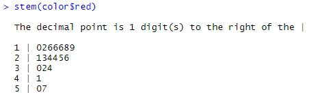
2. 줄기잎그림(Stem and Leaf Diagram)
- 서술적인 면과 그래프의 시각적인 면을 동시에 고려하여 자료의 특성을 나타낼때 사용된다.
|
# csv 파일 읽어들이기 color <- read.csv("C:/pypy/color.csv",header=T) |
 |
|
# red 컬럼 줄기잎그림으로 만들기 stem(color$red) |
 |
|
# blue 컬럼 줄기잎그림으로 만들기 stem(color$blue) |
 |
|
# yellow 컬럼 줄기잎그림으로 만들기 stem(color$yellow) |
 |
'컴퓨터 > R' 카테고리의 다른 글
| R - 시각화 ⑤ ggplot 라이브러리 사용(히스토그램, 상자그림) (0) | 2020.04.23 |
|---|---|
| R - 시각화 ④ ggplot 라이브러리 사용(막대그래프) (0) | 2020.04.22 |
| R - cut (0) | 2020.04.21 |
| R - 시각화 ② scatter plot, histogram (0) | 2020.04.21 |
| R - 시각화 ① pie chart, bar graph (0) | 2020.04.20 |