
1. 상자그림 (box plot)
- 5가지의 요약 수치 값으로 표현된다.
- 최소값(0), 제1사분위수(25), 중위수(50), 제3사분위수(75), 최대값(100)
- 사분위값 : np.percentile(객체,[0,25,50,75,100])
1) 중앙값
: 관측값을 크기순으로 정렬한 후 가운데 위치하는 값
|
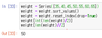
관측값이 홀수일때 중앙값 # 차례로 정렬 했을때 중간번째 있는 값 weight = Series([35,40,45,50,55,60,65])
# 내부에서 이런 식이 돌아가고 있다. weight = Series([35,40,45,50,55,60,65]) |
  |
|
관측값이 짝수일때 중앙값 # 차례로 정렬 했을때 중간번째 있는 두값을 더하고 weight = Series([35,40,45,50,55,60,65,70])
# 내부에서 이런 식이 돌아가고 있다. weight = Series([35,40,45,50,55,60,65,70]) |
  |
2) 사분위 범위(inter-quatile range, IQR)
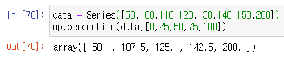
data = Series([50,100,110,120,130,140,150,140,130,200])
np.percentile(data,[0,25,50,75,100])
일때
|
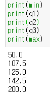
# 각 사분위값 변수에 저장 |
 |
|
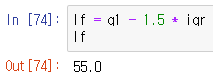
# IQR = 3사분위수 - 1사분위수 iqr = q3-q1 |
 |
|
# 최저한계치(lower fence) 찾는 방법 lf = q1 - 1.5 * iqr lf |
 |
|
# 최고한계치(upper fence) 찾는 방법 uf = q3 + 1.5 * iqr uf |
 |
|
# 제일 아래 수평선 : data[data > lf].min() |
 |
|
# 제일 위 수평선 : data[data < uf].max() |
 |
|
# 아래 이상치 data[data < lf] |
 |
|
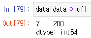
# 위 이상치 data[data > uf] |
 |
3) 상자그림 그리기
|
# matplotlib를 사용한 상자그림 그리기 |
 |
|
# 박스 옆에 값 적어주기 (x축, y축, 적을 값) plt.boxplot(data) |
 |
|
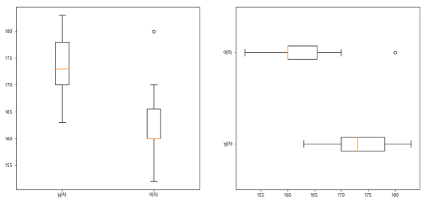
# 여러개의 박스를 동시에 보고 싶을때 height = pd.read_excel("C:/data/height.xlsx") np.percentile(height['남자'],[0,25,50,75,100]) np.percentile(height['여자'],[0,25,50,75,100]) plt.boxplot([height['남자'],height['여자']],labels=['남자','여자']) |
 |
|
# 여러개의 박스를 동시에 보고 싶을때 (수평방향) plt.boxplot([height['남자'],height['여자']], |
 |
|
# 여러그림을 한 화면에 넣을때 fig = plt.figure(figsize=(15,7)) # 한 화면의 크기 만들기 ax1 = fig.add_subplot(1,2,1) # 1행 2열 그림중 1번째 ax2 = fig.add_subplot(1,2,2) # 1행 2열 그림중 2번째 ax1.boxplot([height['남자'],height['여자']], ax2.boxplot([height['남자'],height['여자']], labels=['남자','여자'],vert=False) |
 |
|
# 그림별 제목 넣기 fig = plt.figure(figsize=(15,7)) ax1 = fig.add_subplot(1,2,1) #1행 2열 그림중 1번째 ax2 = fig.add_subplot(1,2,2) #1행 2열 그림중 2번째 ax1.boxplot([height['남자'],height['여자']],labels=['남자','여자']) ax2.boxplot([height['남자'],height['여자']],labels=['남자','여자'],vert=False) ax1.set_title("신입생 성별 키 비교(수직박스)") ax2.set_title("신입생 성별 키 비교(수평박스)") plt.show() |
 |
2. 줄기잎 그림(stem and leaf diagram)
- 수치형 자료으 특성을 나타내고자 할때 유용하다.
- stemgraphic 라이브러리를 따로 설치해주어야 한다.
Anacindat Prompt (관리자권한으로 실행)
pip install -U stemgraphic

import stemgraphic
height = pd.read_excel("C:/data/height.xlsx")
| stemgraphic.stem_graphic(height['남자']) |  |
|
stemgraphic.stem_graphic(height['여자']) |
 |
'컴퓨터 > 파이썬' 카테고리의 다른 글
| 파이썬(Python) - 스크래핑 ① 스크래핑 기초 (0) | 2020.03.25 |
|---|---|
| 파이썬(Python) - 정규표현식과 메타문자 (0) | 2020.03.24 |
| 파이썬(Python) - matplotlib ② histogram (0) | 2020.03.23 |
| 파이썬(Python) - matplotlib ① pie chart / bar chart / line plot (0) | 2020.03.22 |
| 파이썬(Python) - 파이썬에서 오라클 SQL로 접속하는 방법 (0) | 2020.03.19 |